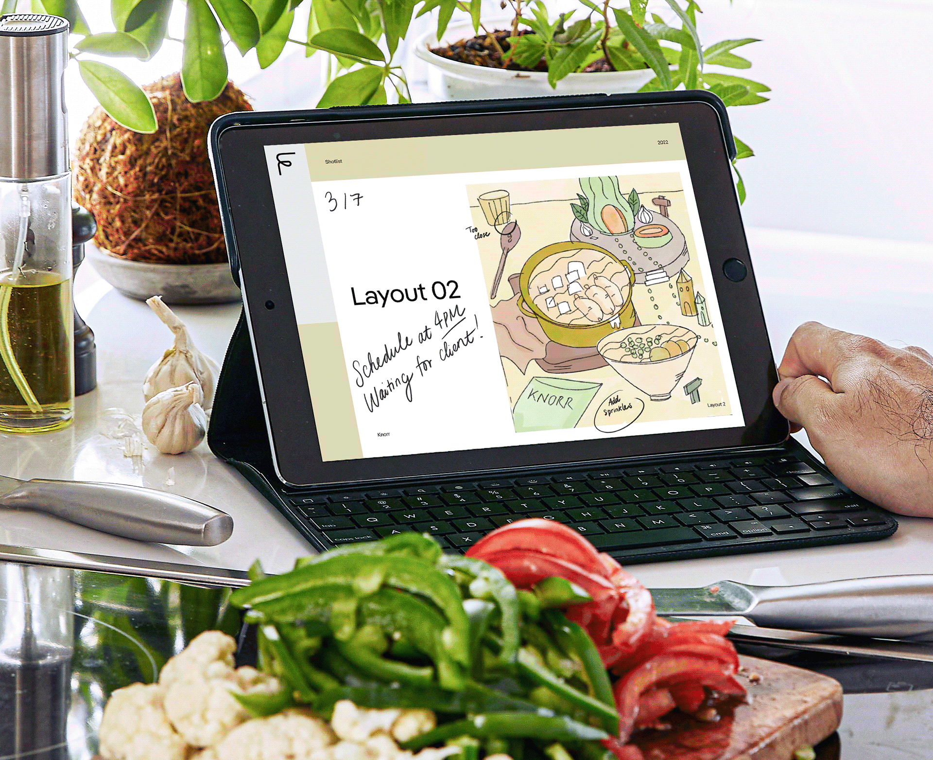
Khe Nguyen is a designer in Brooklyn, NY, focusing on brand identity and UX/UI. She studied at Parsons The New School and is interested in exploring multimedia design to communicate visual ideas.
When she is not designing, you can find Khe with her camera, exploring the cultures and landmarks that the city has to offer.


Comcast Website
(UI)


CBOE Website(UX/UI)


Comcast Cybersecurity
(UX/UI)


HelpScan(UX/UI)

Small Things in Silence(Creative Coding)
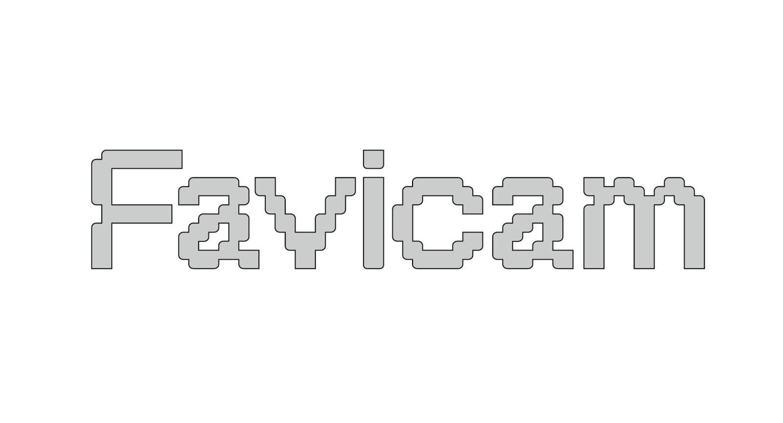

Favicam(Creative Coding)

HIV: Love is Hard(Communication Campaign)

Bakes Xmas(Packaging & Illustration)

FPDB Rebrand(Branding)

The Daily Indecisiveness(Interactive Web)

Renew the digital face of Comcast Corporation, emphasizing how Comcast integrates media and technology for the benefit of consumers and to foster innovation. While retaining the current site structure, the redesign aims to create a vibrant destination, convey a compelling company story, and encourage content discovery based.
GOAL: Provide a visual solution to humanize the company, elevate the entertainment and lean into fun and content of it all.
PROBLEM: The current outdated look of the site doesn't reflect the company's position as the innovative leader in the evolution of the industry. There's a lack of brand voice, a coherent color system, and hierarchy in scale between modules. The grid and layout appear blocky, with little visual appeal.
SOLUTION: Featuring an editorial and tech-inspired design style, the new site offer a clean layout and cutting-edge elements bring a futuristic aesthetic with a touch of sophistication and organization to the web design. This creates a digital experience that mirrors the dynamic and ever-evolving world of technology.
DESIGN SYSTEM:


LANDING PAGE | CURRENT (LEFT) & REDESIGN SITE (RIGHT):


OUR COMPANY | DIVISION C&E | IMPACT:

PRESS ROOM | ARTICLE:

INFOGRAPHIC EXPLORATION:


¯\_(⊙_ʖ⊙)_/¯*¯\_(⊙_ʖ⊙)_/¯*¯\_(⊙_ʖ⊙)_/¯
My Role: UI and Branding Design | Formed and designed a fresh look and feel UI kits and developed the flow for the gamify app.
Credit / Developer: Ricky Blake and Jin Yoon / Code & Theory / Client: Comcast
My Role: UI and Branding Design | Formed and designed a fresh look and feel UI kits and developed the flow for the gamify app.
Credit / Developer: Ricky Blake and Jin Yoon / Code & Theory / Client: Comcast

Proposal to renew the face of Cboe website as the home of volatility trading, relentless spirit of innovation and unparalleled expertise in world exchange.
PROBLEM STATEMENT: The current navigation falls short in representing the page's information architecture, result in the misinterpretation of the complexity between regional and global product-based business lines, and concealing secondary (pages within a section) and tertiary navigation schemes.
SOLUTION: A nav bar organized by what a user,s looking for, not the lines of business.
PROJECT GOAL: Gamification - Use the interest in one product category to drive interest in related product categories across the site. Initial screens for “Smart nav” that serves as a companion to guide a user on their journey with recommendations and a reflection of the journey they,re on.
Navigation Bar Current vs Proposal:


USER FLOW:

DEMO NAV FLOW:

CBOE BRAND SYSTEM


LANDING PAGE | CURRENT (LEFT) & REDESIGN SITE (RIGHT):


¯\_(⊙_ʖ⊙)_/¯*¯\_(⊙_ʖ⊙)_/¯*¯\_(⊙_ʖ⊙)_/¯
My Role: UXUI | Supported the restructuring the nav bar and translated desktop to mobile design.
Credit / Design Director: Isabel Sousa / Code & Theory / Client: CBOE
My Role: UXUI | Supported the restructuring the nav bar and translated desktop to mobile design.
Credit / Design Director: Isabel Sousa / Code & Theory / Client: CBOE

As part of the design team working on Comcast Cybersecurity Experience, I supported the lead designer, the research and the information architecture team to redefine the brand's internal cybersecurity tool. This tool is used for internal purposes, aiding in the identification of potential security threats based on data anomalies and tracking compliance in data security platforms among users.
INFORMATION DESIGN:
Redesign and simplify the external tool into the internal table system for entity diagram.
INFORMATION DESIGN:
Redesign and simplify the external tool into the internal table system for entity diagram.


Stage 1: Translate the external diagram structure into the internal table and test different diagram structures.
Stage 2: Add feature for grouping event nodes, the risk elevating events will be called out with a badge on side panel.
Stage 3: Testing versions for both event node panel and diagram nodes expansion.
Stage 4: Apply UI Kits Design.
Stage 2: Add feature for grouping event nodes, the risk elevating events will be called out with a badge on side panel.
Stage 3: Testing versions for both event node panel and diagram nodes expansion.
Stage 4: Apply UI Kits Design.
Prototype Entity Diagram View:

Prototype Entity Diagram View:
Redesign and simplify the external tool into the internal table system for entity diagram.
Redesign and simplify the external tool into the internal table system for entity diagram.


Color: Light Mode and Dark Mode


Prototype Entity User Detail Table


¯\_(⊙_ʖ⊙)_/¯*¯\_(⊙_ʖ⊙)_/¯*¯\_(⊙_ʖ⊙)_/¯
My Role: Prototype & UI Kits | Translated wireframe into high-fidelity prototype and developed components library.
Credit / Lead Designer: Sanchi Oberoi / Code & Theory / Client: Comcast
My Role: Prototype & UI Kits | Translated wireframe into high-fidelity prototype and developed components library.
Credit / Lead Designer: Sanchi Oberoi / Code & Theory / Client: Comcast
If you think about it, favicon - a website tab icon - is the smallest canvas on your computer screen. As a blank canvas, the room for creativity is endless. Yet, majority of websites use favicon to hold static logos. Favicam is a personal project that pushes the boundary of the favicon and what can be placed on the computer's smallest canvas.
<<< Click here to explore Favicam>>>
¯\_(⊙_ʖ⊙)_/¯*¯\_(⊙_ʖ⊙)_/¯*¯\_(⊙_ʖ⊙)_/¯
My Role: Design and Developing
Credit: / Superviser: Eric Li / Project: CD Studio: JavaScript
<<< Click here to explore Favicam>>>
¯\_(⊙_ʖ⊙)_/¯*¯\_(⊙_ʖ⊙)_/¯*¯\_(⊙_ʖ⊙)_/¯
My Role: Design and Developing
Credit: / Superviser: Eric Li / Project: CD Studio: JavaScript

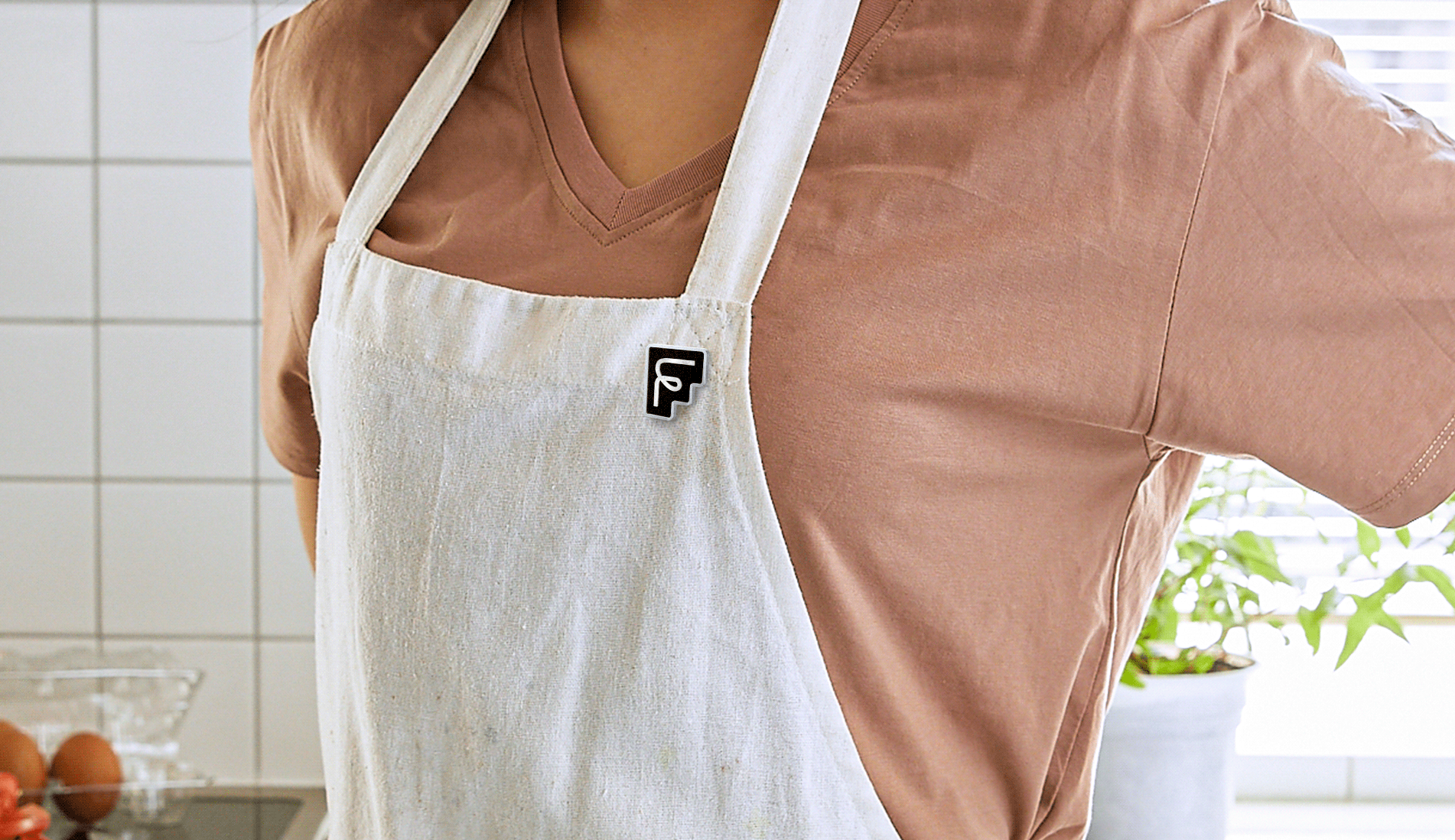
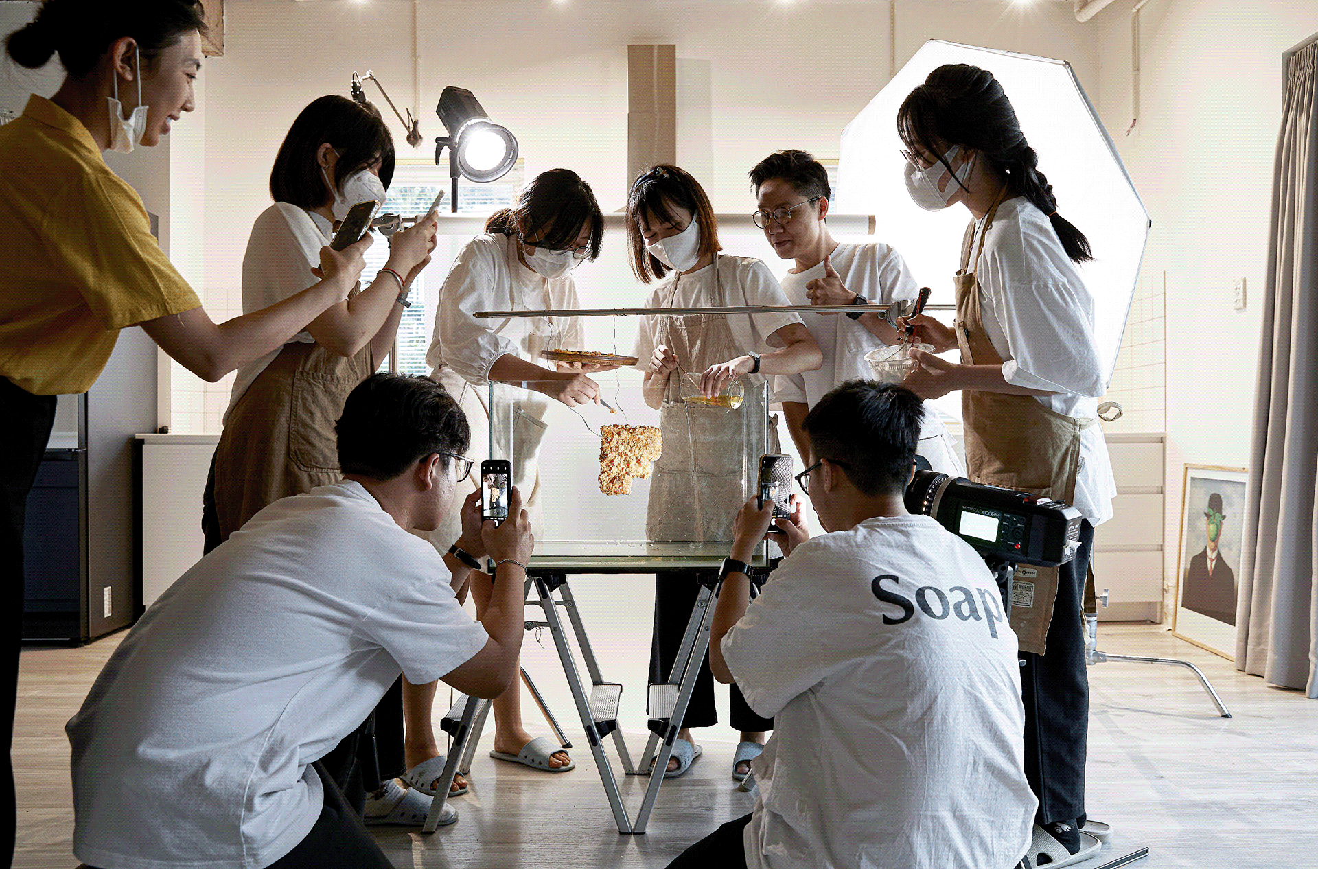
FPDB is a leading food photography studio from Ho Chi Minh city. The studio has a long passionate history for food and its spiritual influences to Vietnamese culture. FPDB doesn’t just capture your food, they bring out the best of your food and tell brand’s story through photography. With their mission of change the visual of the F&B industry in Vietnam about creativity and high standards, Tuan Ha and I proposed a new culinary approach to their branding, changed the name from FPWDB to FPDB and focusing on Food First, Everything Else Second.
With the Food First approach as the starting point for every project, the stylized “F” represents a core facet of the brand’s identity. Its freeform contrasts with geometric letters, conveying dual expressions of creativity and professionalism. The intentionally staggered composition breaks up visually similar letters and improves comprehension: in other words, FPDB ≠ FBDP.
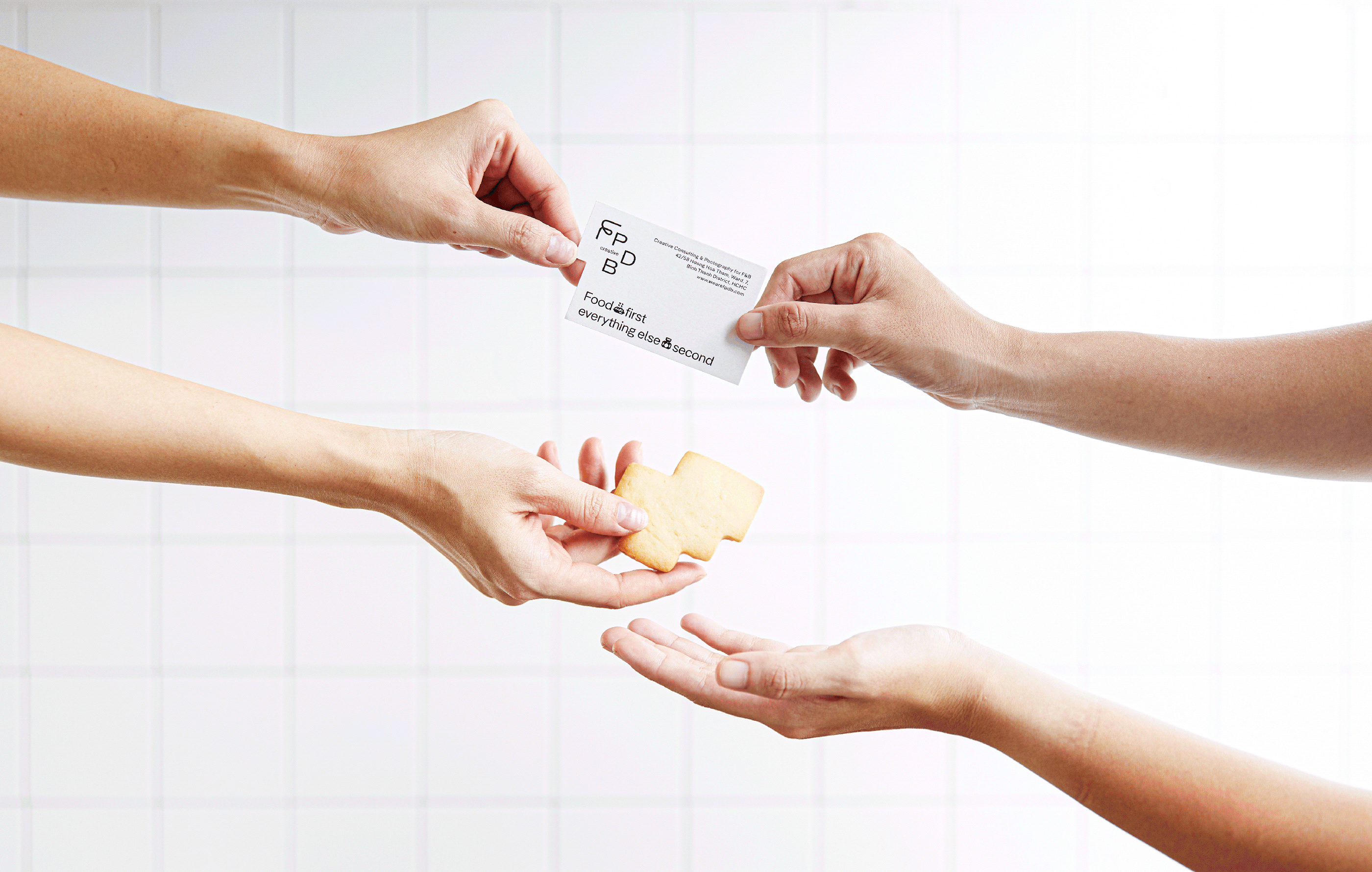

Lending a touch of whimsy to the font system, a series of food emojis are embedded into the typeface improving the usability of the brand's visual components across platforms and communication channels.

¯\_(⊙_ʖ⊙)_/¯*¯\_(⊙_ʖ⊙)_/¯*¯\_(⊙_ʖ⊙)_/¯
My Role: Branding & Ideate | Visualized brand vision, restructured brand name and designed interactive branding system
Credit / Co-deisnger: Tuan Ha / Superviser: Tuan Le / Client: FPDB
My Role: Branding & Ideate | Visualized brand vision, restructured brand name and designed interactive branding system
Credit / Co-deisnger: Tuan Ha / Superviser: Tuan Le / Client: FPDB

“What's for dinner?" is supposedly a simple question, except they are universally proven to be unexpectedly difficult. In today's world of unlimited options promoted by overconsumption, the average adult is now presented with 35,000 conscious decisions on a daily basis, compounding the psychological weight of choice paralysis: if the choice is not perfect, it is easy to imagine that you could have made a different selection to produce a better result. This puts pressure on even the most insignificant daily decisions.

For my thesis, I examine the ramifications of choice paralysis through a series of four informative and interactive explorations into the behavioral science behind this dilemma by visualizing common patterns that influence difficult choices.

Study 1 | Choice Overload: inspects the amount of options offered and whether more options help or hinder decision making.

Study 2 | Satisfiers vs Maximizers: reveals your decision making style and how it contributes to indecisiveness.

Study 3 | Hard Choice: considers the consequence of choice and if knowledge of consequence makes the decision easier.
Study 4 | Regret of Inaction: asks people to reflect on past regret of action and inaction to find a pattern in decision making.
<<< Click here to view full Thesis Presentation>>>
<<< Click here to view full Thesis Presentation>>>
¯\_(⊙_ʖ⊙)_/¯*¯\_(⊙_ʖ⊙)_/¯*¯\_(⊙_ʖ⊙)_/¯
My Role: Research, Ideate, Design and Illustration
Credit / Superviser: Matt Barnes and Juliette Cezzar / BFA CD Thesis
My Role: Research, Ideate, Design and Illustration
Credit / Superviser: Matt Barnes and Juliette Cezzar / BFA CD Thesis
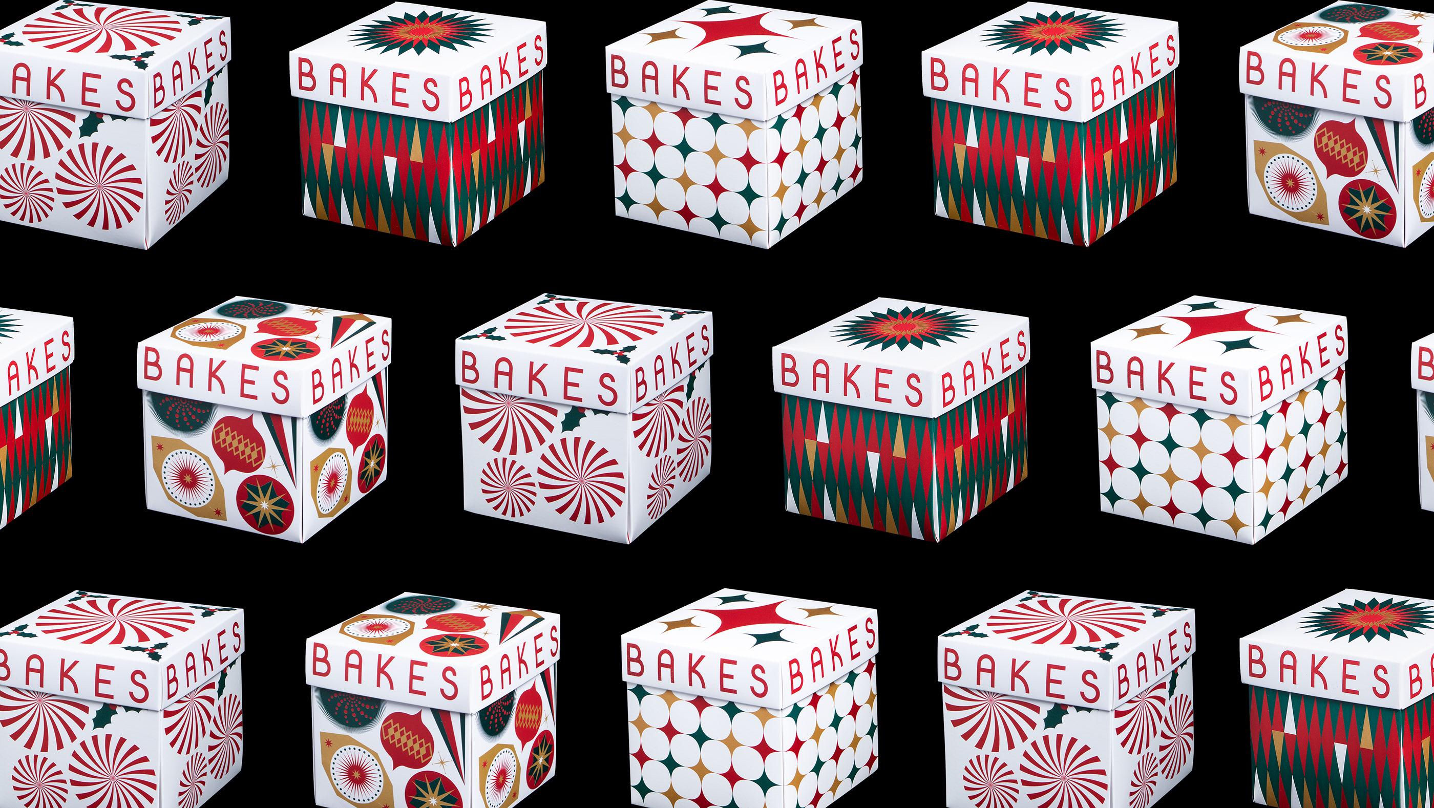
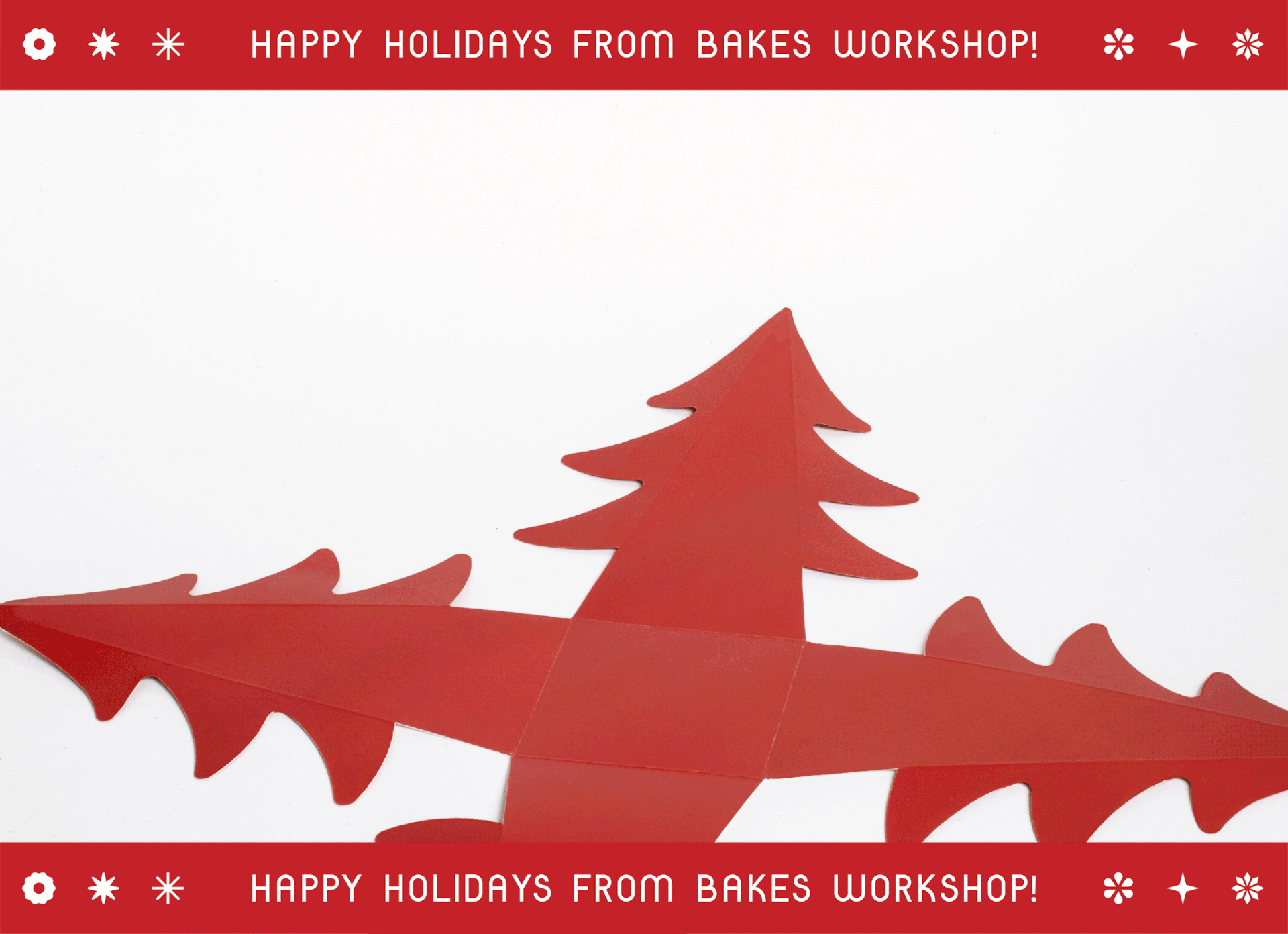
Merry Christmas! This is the first Christmas after a long year of
pandemic is a special event to celebrate. We brought a playful and
nostalgia holiday through the concept of Santa Workshop to Bakes
Saigon and reimagined festive holiday patterns as packaging.
Elements for packaging feature Santa's factories where Bakes
hardworking elf prepare delicious pastries for the special day.
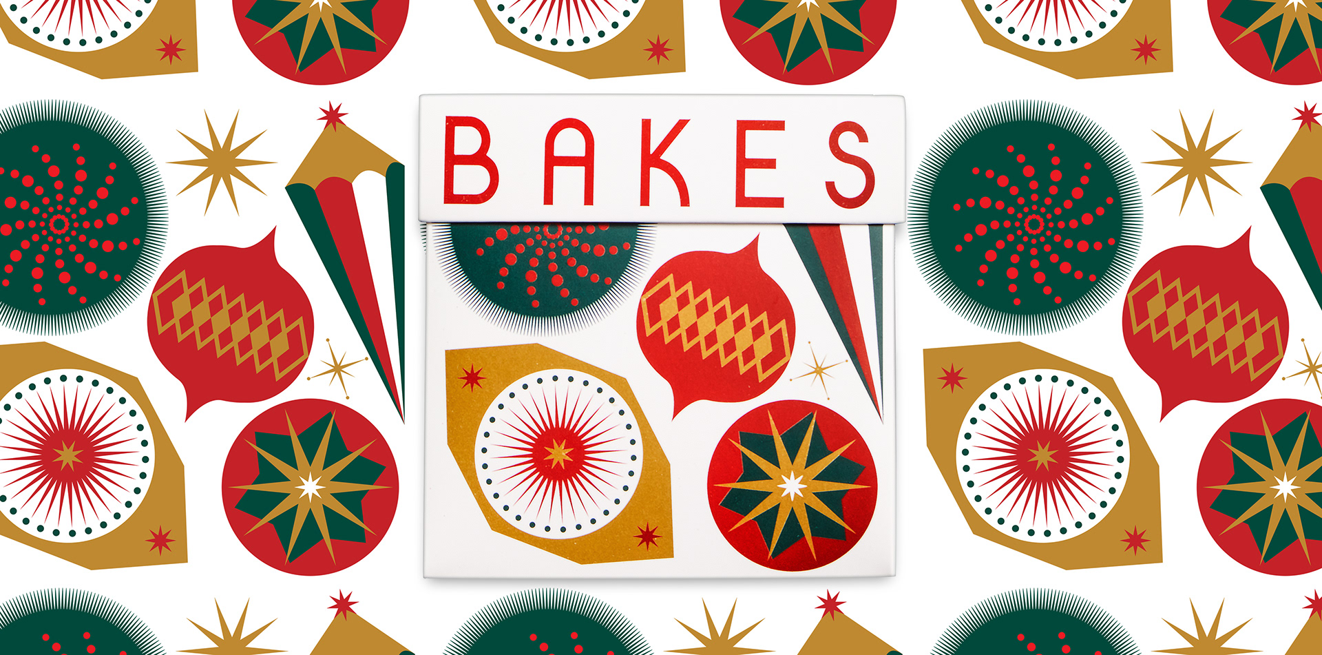
Ornaments don't just belong on trees.
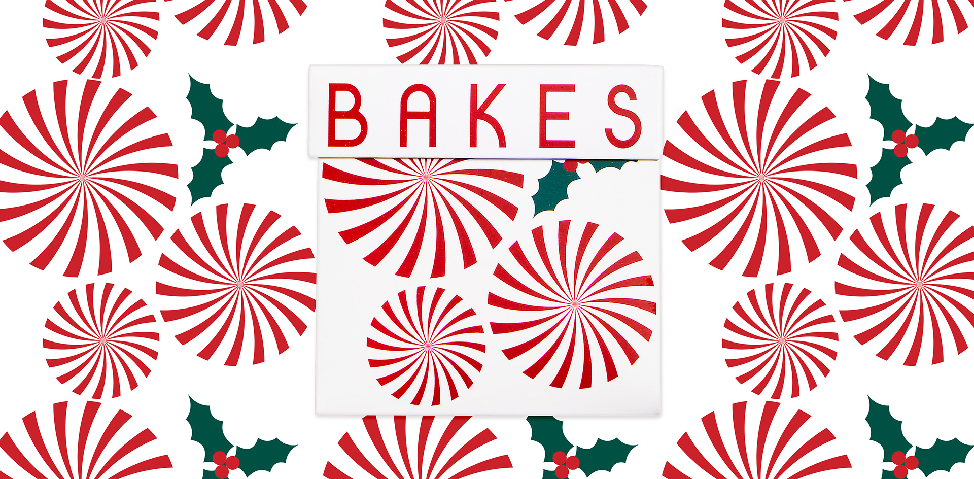
Candy cane, as a box for cookies.
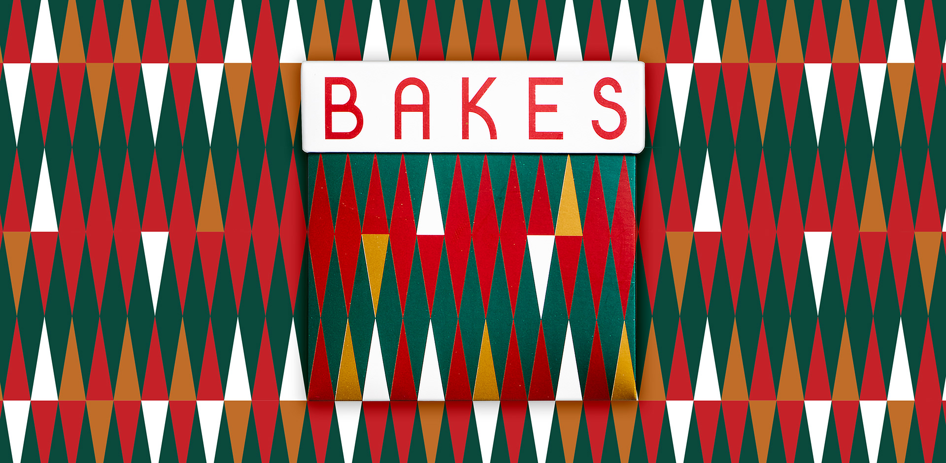
Boardgame designers are the most underrated designers of all time.
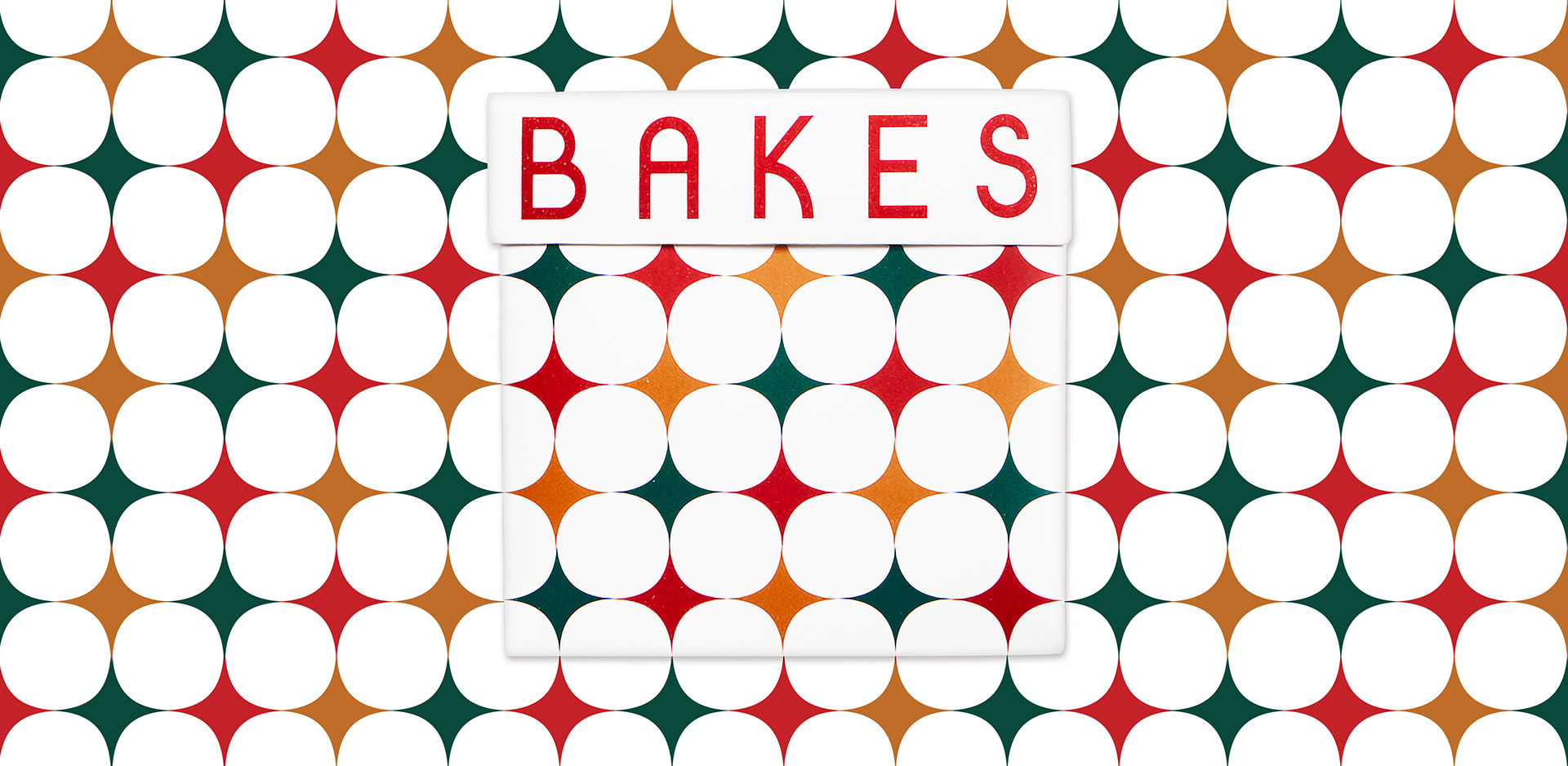
Twinkle twinkle little box of pastries.
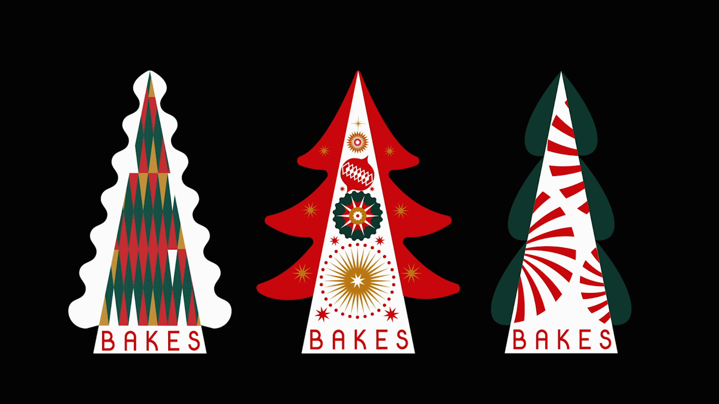
Tea boxes in the shape of pine trees.

¯\_(⊙_ʖ⊙)_/¯*¯\_(⊙_ʖ⊙)_/¯*¯\_(⊙_ʖ⊙)_/¯
My Role: Design and Illustration | Worked with production for material sourcing and post-production editing
Credit / Co-deisnger: Tran N Nguyen, Andree Nguyen / Superviser: Tuan Le / Client: Bakes Saigon
My Role: Design and Illustration | Worked with production for material sourcing and post-production editing
Credit / Co-deisnger: Tran N Nguyen, Andree Nguyen / Superviser: Tuan Le / Client: Bakes Saigon


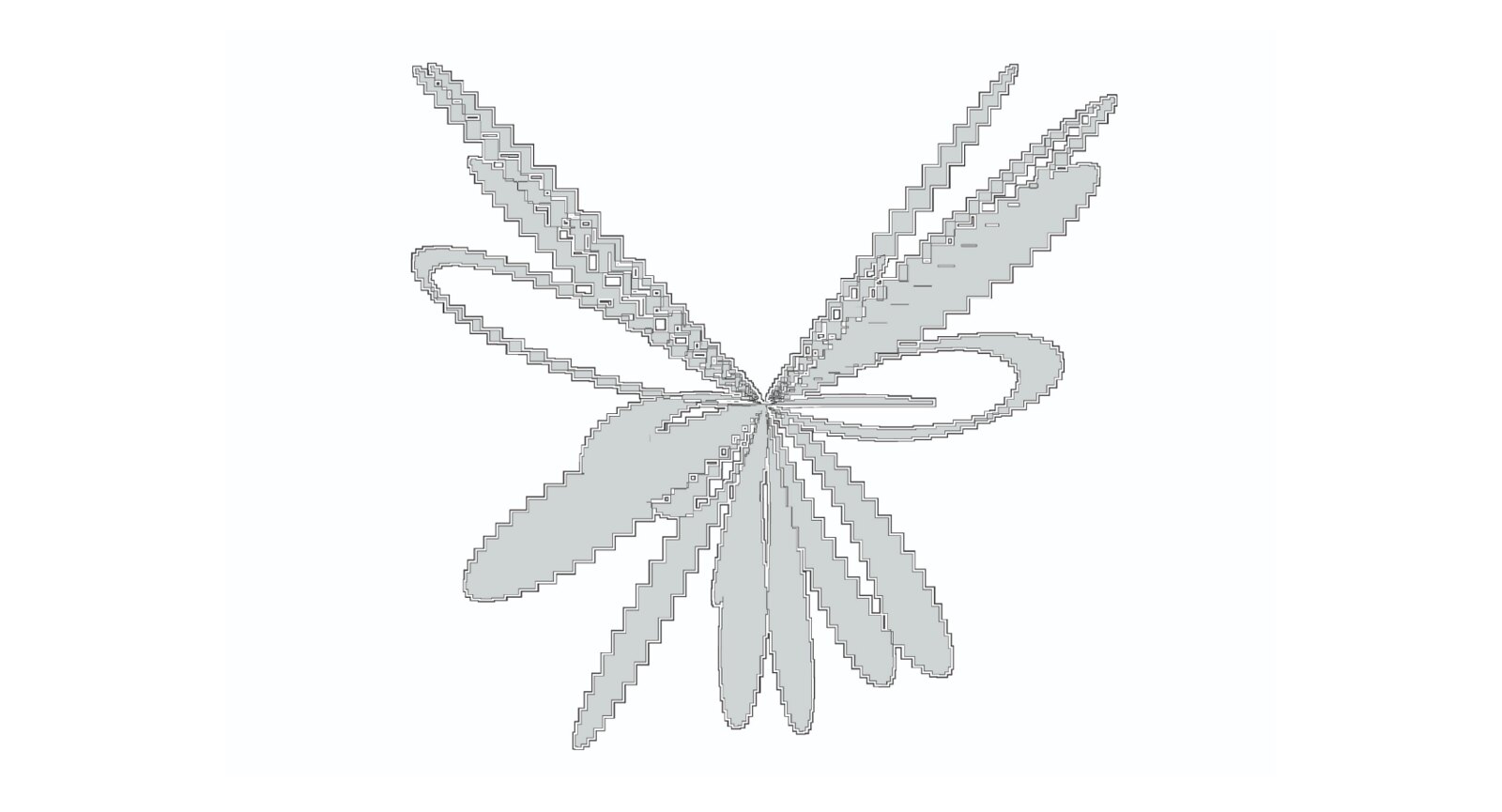
The project is a study of sine/cosine waves and noise in p5.js, with the final form being a collection of 100 generative framed butterflies. The forming process is like a butterfly going through different peculiar phases before transforming into a beautiful thing.


¯\_(⊙_ʖ⊙)_/¯*¯\_(⊙_ʖ⊙)_/¯*¯\_(⊙_ʖ⊙)_/¯
My Role: Design and Develop P5.js
Credit: / Superviser: John Provencher / Project: A-Generative-Web
My Role: Design and Develop P5.js
Credit: / Superviser: John Provencher / Project: A-Generative-Web

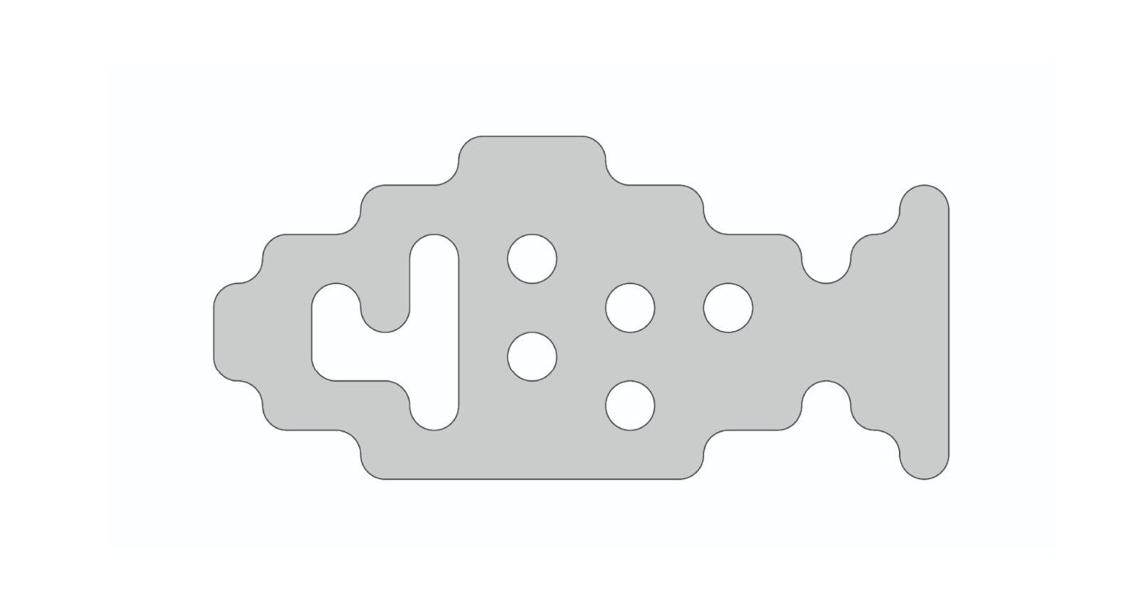
McKinsey German researchers approached The Lab's design team to create a new interface design for their self-scanner supplement device, to be implemented in some of the largest pharmacy chains in Germany.
PROBLEM:
Health literacy is a main issue when looking for dietary supplements. Customers, especially the older generations, often face challenges such as accessing technology, understanding medical information, determining the credibility of information, and having limited access to pharmacists or professional help.
SOLUTION:
Gamification - Turn the stress of making medical decision into a game through a self-scan kiosk that offer in-store supplements.
HOW:
Each decision touch-point is connected to a body part of the HelpScan mascot. The flow is designed to minimize stress and guide users through the scanning process. Once decisions are made, all parts will come together to create a personal mascot that fits user needs and supplements. The design of the mascot is inspired by pill shapes, medical supplies, and daily exercise to boost stamina.

To overcome health-literacy related challenges faced by older generations, pharmacies must position as advisors. They should provide credible information, accessible way help patients understand therapeutic regimens, and ensure an enjoyable, informative experience with new technology.

Understanding the customer journey is vital for utilizing our medical database effectively. Identifying needs and optimizing solutions, we pinpointed key issues hindering customers during pharmacy visits and decision-making. Online, overwhelmed customers seek pharmacist guidance, but staff shortages lead to limited assistance, leaving them disappointed.

To save user time and simplified experience when visiting a pharmacy, we designed HelpScan with a simple six-step app structure for users to search, diagnose symptoms, and get medication or supplement scans.

HelpScan employs gamification, translating crucial decisions of the process into a medical mascot's body parts. Users' choices shape the mascot, offering supplement recommendations and health advice. Inspired by pills and medical supplies, the design incorporates the mascot's motion with exercises for daily strength.

Leveraging a third-party database, we revamped the app for user-friendliness, adopting a minimal, linear design with step-by-step directions and voice-over. Playful details enhance the interface, each screen limited to 2-3 actions, preventing user confusion.

Step 1: Welcome Page & Step 2: Scan Supplement

Step 3: Confirm Scan & Step 4: Alternative Supplement

Step 5: Finalize Choice & Step 6: Sent prescription via SMS/Email or to Counter
We tested the prototype with users, reaching out for interviews, speeding recruitment. Guided by customer feedback, we updated designs.
<<<Click here for high-fidelity prototype >>>
¯\_(⊙_ʖ⊙)_/¯*¯\_(⊙_ʖ⊙)_/¯*¯\_(⊙_ʖ⊙)_/¯
My Role: UI and Branding Design | Formed and designed a fresh look and feel UI kits and developed the flow for the gamify app.
Credit: / Superviser: Tuan Le / Co-Designer: Trang Dinh / Research and Database: McKinsey Berlin

230,000 people live with HIV in Vietnam. Against the backdrop of centuries-old sexual norms and decades-old HIV prevention propaganda, Love is Hard addresses the long-rooted cultural stigmas against same-sex relationships and pharmaceutical intervention. The 2022 program contrasts the ups and downs of love with the mundane simplicity of HIV prevention using PrEP — “It's just a pill.”

The first part of the campaign provides a first-person perspective of the cultural narratives surrounding these challenges, beginning with an open call for members of the LGBTQ+ community to submit their real stories about love. While we initially only expected around 100 responses, we ended up with over 1,500; these stories were so impactful that we decided to edit and compile 1,096 entries into a three-volume series.
<<<Click here for view Vol1, Vol2, Vol3 >>>
<<<Click here for view Vol1, Vol2, Vol3 >>>


The second part of the campaign focuses on visual storytelling with a series of posters dramatizing the trials and tribulations of navigating same-sex relationships. Drawing inspiration from the Ðông Hồ painting style—known for its traditional value in portraying social, philosophical, and humanitarian desires—the art direction juxtaposes the contemporary simplicity of taking a pill against the historic barriers of love in Vietnamese society.

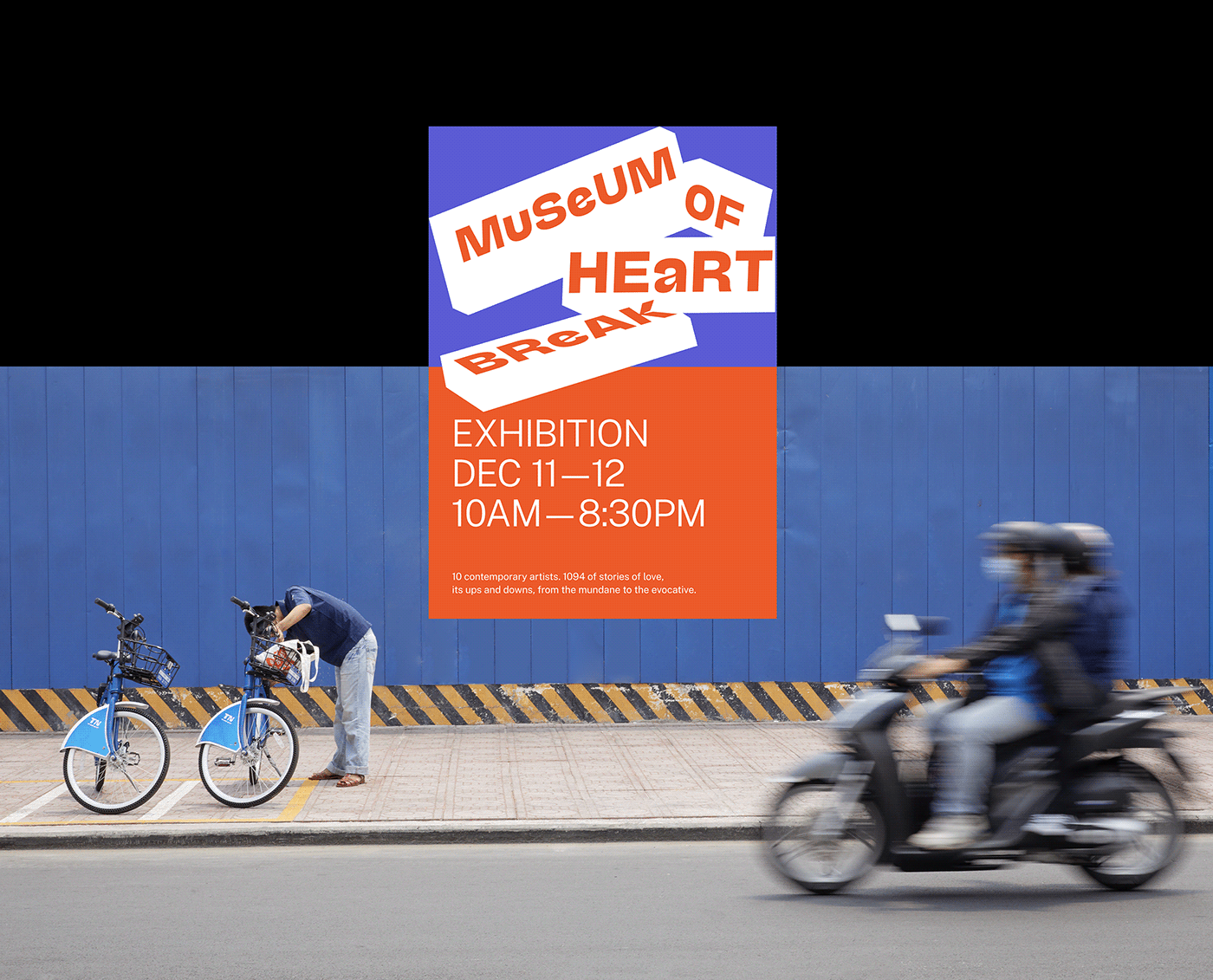
Combining linguistic and artistic mediums, the campaign's finale culminates in a multidisciplinary exhibition The Museum of Heartbreak, showcasing the work of contemporary musicians, filmmakers, and artists through a series of ten installations inspired by their own experiences.
<<<Click here for full campaign summary >>>
<<<Click here for full campaign summary >>>

¯\_(⊙_ʖ⊙)_/¯*¯\_(⊙_ʖ⊙)_/¯*¯\_(⊙_ʖ⊙)_/¯
My Role: Conceptualized idea, designed digital/print visuals and working with developer for campaign/exhibition website
Credit: / Superviser: Tuan Le / Co-Designer: Reo Le, Tran N Nguyen, Andree Nguyen
My Role: Conceptualized idea, designed digital/print visuals and working with developer for campaign/exhibition website
Credit: / Superviser: Tuan Le / Co-Designer: Reo Le, Tran N Nguyen, Andree Nguyen

